import { QuillProvider, SQLEditor } from "@quillsql/react";

function App() {
  return (
    <QuillProvider tenants={[{ tenantField: "customer_id", tenantIds: [2] }]} publicKey={process.env.QUILL_PUBLIC_KEY}>
      <SQLEditor />
    </QuillProvider>
  );
}
Make sure QuillProvider is a parent of the SQLEditor component.
Examples
Ant Design
Material Design
![Edit [Ant Design] Quill React Components](https://codesandbox.io/static/img/play-codesandbox.svg)
import { SQLEditor } from "@quillsql/react";

import { AntTable } from "./ui/ant/Table";
import { AntSelectComponent } from "./ui/ant/SelectComponent";
import { AntButton, AntSecondaryButton } from "./ui/ant/Button";
import { AntTextInput } from "./ui/ant/Input";

export function AntSQLEditor() {
  return (
    <SQLEditor
      ButtonComponent={AntButton}
      SecondaryButtonComponent={AntSecondaryButton}
      TextInputComponent={AntTextInput}
      SelectComponent={AntSelectComponent}
      TableComponent={AntTable}
    />
  );
}
import { SQLEditor } from "@quillsql/react";

import { MaterialTable } from "./ui/material/Table";
import { MaterialSelect } from "./ui/material/Select";
import { MaterialButton, MaterialSecondaryButton } from "./ui/material/Button";
import { MaterialTextInput } from "./ui/material/Input";

export function MaterialSQLEditor() {
  return (
    <SQLEditor
      ButtonComponent={MaterialButton}
      SecondaryButtonComponent={MaterialSecondaryButton}
      TextInputComponent={MaterialTextInput}
      SelectComponent={MaterialSelect}
      TableComponent={MaterialTable}
    />
  );
}
Props
ButtonComponent
(props: ButtonComponentProps) => JSX.Element
A primary button component.
export function ButtonComponent({ onClick, label, disabled, icon }) {
	return (
		<button onClick={onClick} disabled={disabled}>
			{icon}
			{label}
		</button>
	);
}
A callback fired when the button is clicked.
The text content of the button.
Whether the button is disabled.
An icon to put in front of the label.
SecondaryButtonComponent
(props: ButtonComponentProps) => JSX.Element
A secondary button component.
export function SecondaryButtonComponent({ onClick, label, disabled, icon }) {
	return (
		<button onClick={onClick} disabled={disabled}>
			{icon}
			{label}
		</button>
	);
}
A callback fired when the button is clicked.
The text content of the button.
Whether the button is disabled.
An icon to put in front of the label.
DeleteButtonComponent
(props: DeleteButtonComponentProps) => JSX.Element
A small delete button used to click out of things. Usually an “X” icon.

import { deleteSVG } from "./ui/icons";
export function DeleteButtonComponent({ onClick }) {
	return <button onClick={onClick}>{deleteSVG}</button>;
}
DeleteButtonComponentProps
A callback fired when the button is clicked.
TextInputComponent
(props: TextInputComponentProps) => JSX.Element
A input element for getting text from the user.
export function TextInputComponent({ id, width, value, label, placeholder, onChange }) {
	return (
		<label>
			{label}
			<input
				id={id}
				style={{ width }}
				value={value}
				placeholder={placeholder}
				onChange={onChange}
			/>
		</label>
	);
}
The id of the input element.
The width of the input element in pixels.
The width of the input element in pixels.
A label for the text input.
The placeholder for the input element.
onChange
(event: ChangeEvent<HTMLInputElement>) => void
required
An event callback that is fired when the input value changes.
SelectComponent
(props: SelectComponentProps) => JSX.Element
A select element for letting the user select from a set of options.
export function SelectComponent({ value, label, width, onChange, options }) {
	return (
		<label>
			{label}
			<select value={value} onChange={onChange} style={{ width }}>
				{options.map(({ value, label }) => <option value={value}>{label}</option>)}
			</select>
		</label>
	);
}
options
{ value: string; label: string; }[]
required
The select options.
onChange
(event: ChangeEvent<HTMLInputElement>) => void
required
An event callback that is fired when the selected element changes.
The width of the select element in pixels.
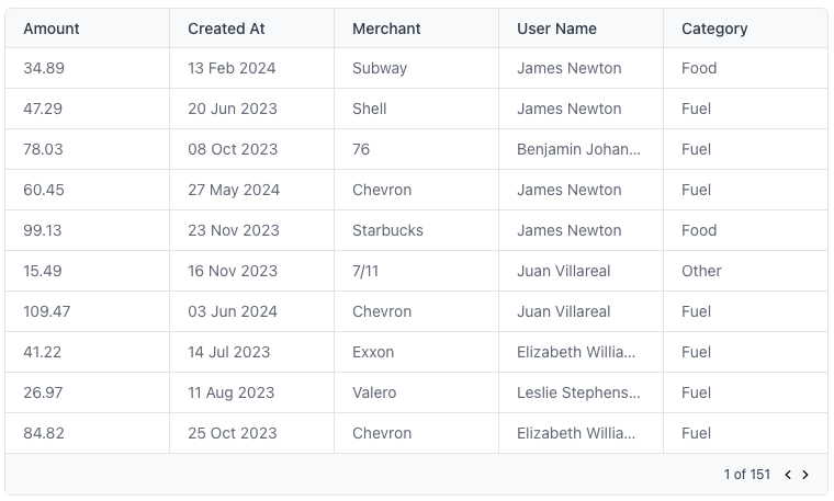
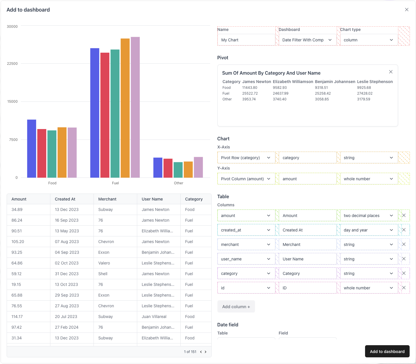
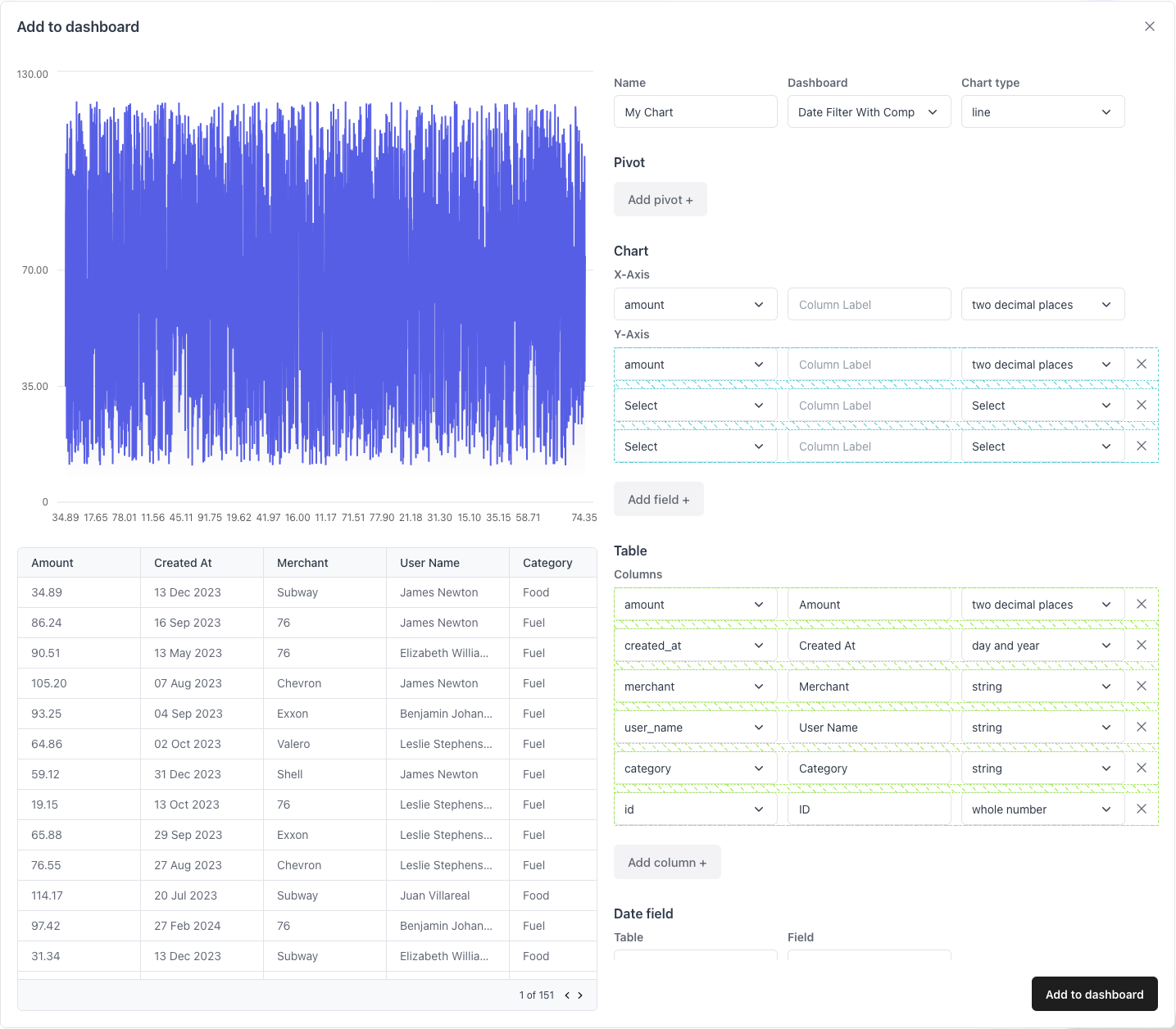
TableComponent
(props: TableComponentProps) => JSX.Element
A table component.
import { Table } from "./ui/table";
import { LoadingSkeleton } from "./ui/loading";

export function TableComponent({ rows, columns, isLoading }) {
	if (isLoading) return <LoadingSkeleton />
	return <Table rows={rows} columns={columns} />;
}
rows
{ [key: string]: any }[]
required
The rows of the table are an array of objects.
columns
{ label: string; field: string; }[]
required
The columns of the table are an array of label, field pairs.
Whether the table is loading.
A component to show while the query results are loading.
CardComponent
(props: CardComponentProps) => JSX.Element
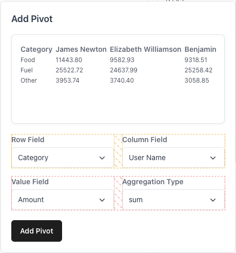
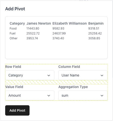
A card component used as a dismissable container of pivot information.
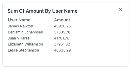
import { Card } from "./ui/card";
export function CardComponent({ onClick, onDelete, children }) {
	const style = { position: 'absolute', top: 0, right: 0 };
	return (
		<Card onClick={onClick} style={{ position: 'relative' }}>
			{onDelete && <DeleteButton style={style} onClick={onDelete} />}
			{children}
		</Card>
	);
}
The children of the container.
A callback that is fired when the card is clicked.
A callback that is fired the card is deleted.
ModalComponent
(props: ModalComponentProps) => JSX.Element
A modal component to use to open the add to dashboard dialog.
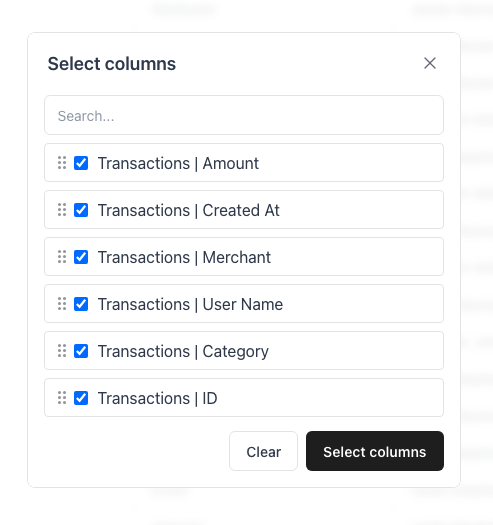
import { Modal } from "./ui/modal";
export function ModalComponent({ isOpen, setIsOpen, title, children, width, height }) {
	return (
		<Modal
			isOpen={isOpen}
			setIsOpen={setIsOpen}
			title={title}
			style={{ width, height }}
		>
			{children}
		</Modal>
	);
}
Whether the modal is open.
setIsOpen
(isOpen: boolean) => void
required
A callback to set whether the modal is open.
The title of the modal, if any.
The width of the modal, in pixels.
The height of the modal, in pixels.
PopoverComponent
(props: PopoverComponentProps) => JSX.Element
A popover component.
import { Popover } from "./ui/popover";

export function PopoverComponent({ isOpen, setIsOpen, popoverTitle, popoverChildren }) {
	return (
		<Popover isOpen={isOpen} setIsOpen={setIsOpen} title={popoverTitle}>
			{popoverChildren}
		</Popover>
	);
}
Whether the modal is open.
setIsOpen
(isOpen: boolean) => void
required
A callback to set whether the modal is open.
The label for the trigger of this popover.
The title of the popover.
The children of this popover.
LabelComponent
(props: { label: string }) => JSX.Element
A label component.

export function LabelComponent({ label }) {
	return <h4>{label}</h4>;
}
The label of the label component.
A header component.
export function HeaderComponent({ label }) {
	return <h2>{label}</h2>;
}
The label of the header component.
A sub-header component describes a group of inputs.
export function SubHeaderComponent({ label }) {
	return <h3>{label}</h3>;
}
The label of the sub-header component.
TextComponent
(props: { label: string }) => JSX.Element
A simple text component.

export function TextComponent({ label }) {
	return <p>{label}</p>;
}
The label of the text component.
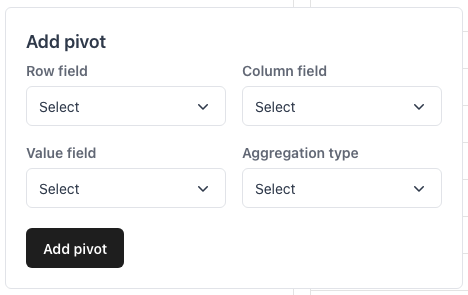
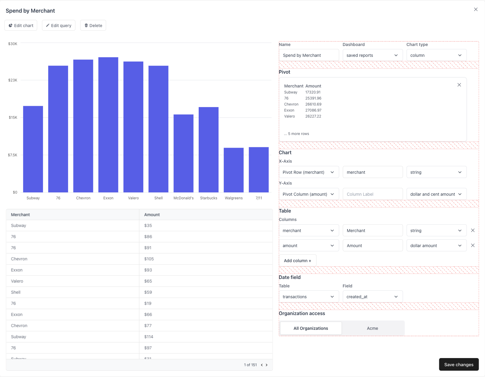
ChartBuilderInputRowContainer
(props: { children: ReactNode }) => JSX.Element
A container for each row of inputs for the ChartBuilder form.
ChartBuilderInputRowContainerProps
The children of the container.
ChartBuilderInputColumnContainer
(props: { children: ReactNode }) => JSX.Element
A container for vertically-stacked rows of inputs for the ChartBuilder form.
ChartBuilderInputColumnContainerProps
The children of the container.
PivotRowContainer
(props: { children: ReactNode }) => JSX.Element
A container for each row of inputs for the pivot form.
The children of the container.
PivotColumnContainer
(props: { children: ReactNode }) => JSX.Element
A container for vertically-stacked rows of inputs for the pivot form.
PivotColumnContainerProps
The children of the container.
ChartBuilderFormContainer
(props: { children: ReactNode }) => JSX.Element
A container for vertically-stacked sections of the chart builder form.
ChartBuilderFormContainerProps
The children of the container.
ErrorMessageComponent
(props: { children: ReactNode }) => JSX.Element
A component that displays error messages.

export function ErrorMessageComponent({ errorMessage }) {
	return <div>{errorMessage}</div>
}
ErrorMessageComponentProps
A callback that is fired when the query changes.
A callback that is fired when the data changes.
A callback that is fired when the data fields change.
A callback that is fired when the data columns change.
onAddToDashboardComplete
(report: QuillReport) => void
A callback that is fired when a new report has been added to a dashboard.
isChartBuilderHorizontalView
Whether the ReportBuilder is in admin mode (default: true).
A callback that is fired when the data columns change.
Whether the “new query” button is enabled.
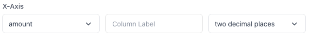
Whether to show table format options.
Whether to show date field options.
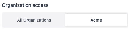
Whether to show access control options.
An existing report to edit.
The default query to use as a placeholder.
The default dashboard to add reports to.
The title of the ChartBuilder dialog.
The label of the button to add the current query to a dashboard.
addToDashboardButtonLabel
string
default:"Add to dashboard"
The label of the button to open the ChartBuilder dialog.
The name of the current organization.
Styles the top-level container of the SQLEditor.This can be useful for TailwindCSS-style classname strings.
Custom styling properties for the ReportBuilder’s top-level container.