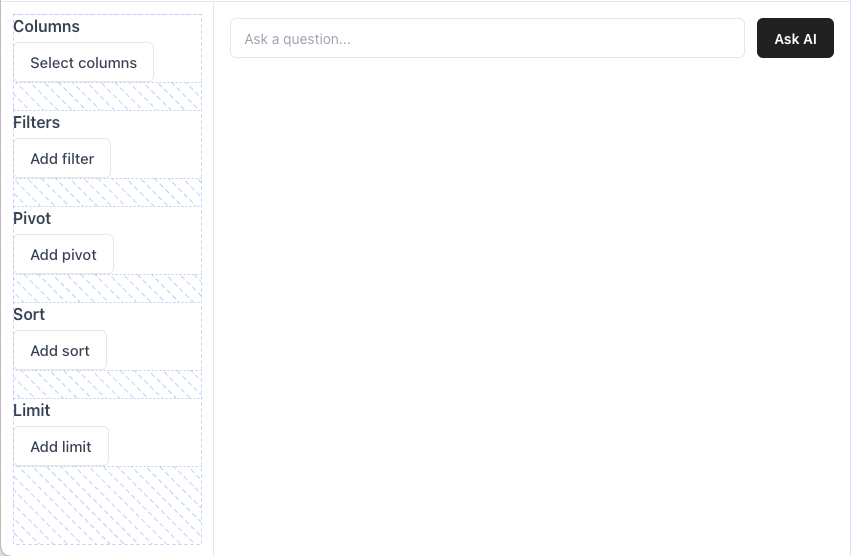
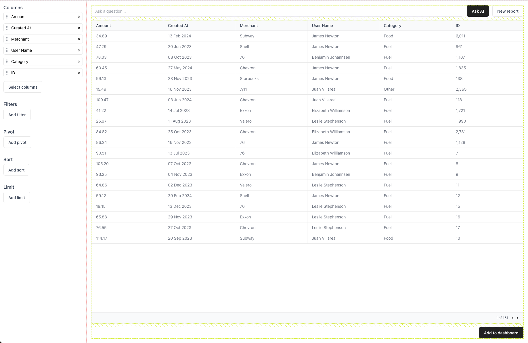
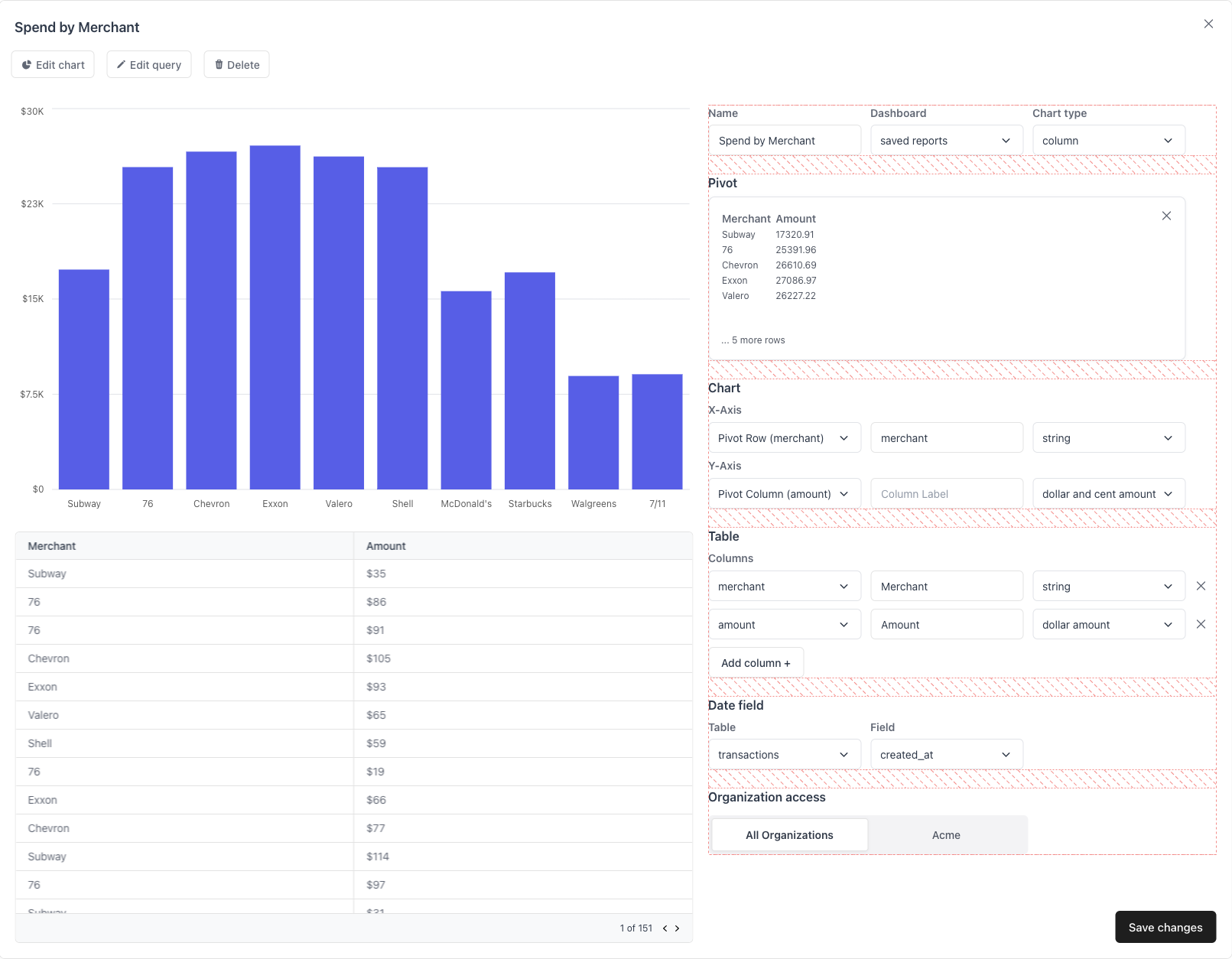
Allows non-technical users to build SQL queries using either UI or AI and
then edit them on the fly. Once users have constructed a query they like,
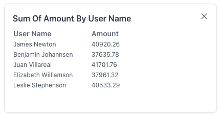
they can click a button and add that report to their dashboard or export it
as a CSV.
Make sure QuillProvider is a parent of the ReportBuilder component.
Examples Ant Design
Material Design
Prefetch data from a particular table You can pass an initialTableName to have the report builder automatically load
data from a particular table in your schema.
Edit an existing report You can pass a reportId to have the report builder load the metadata for a
pre-existing report. This might be useful if you want to allow your end
users to edit the reports they created.
Query all views in your Quill schema By default, the Quill Report Builder will query all tables in your schema and
new reports will be created upon completion.
Props The default table name to show when first loading the ReportBuilder. Sets the dashboard of a report created in the report builder. Sets the dashboard section of a report created in the report builder. ButtonComponent (props: ButtonComponentProps) => JSX.Element
A primary button component. A callback fired when the button is clicked.
The text content of the button.
Whether the button is disabled.
An icon to put in front of the label.
SecondaryButtonComponent (props: ButtonComponentProps) => JSX.Element
A secondary button component. A callback fired when the button is clicked.
The text content of the button.
Whether the button is disabled.
An icon to put in front of the label.
DeleteButtonComponent (props: DeleteButtonComponentProps) => JSX.Element
A small delete button used to click out of things. Usually an “X” icon. DeleteButtonComponentProps A callback fired when the button is clicked.
TextInputComponent (props: TextInputComponentProps) => JSX.Element
A input element for getting text from the user. The id of the input element.
The width of the input element in pixels.
The width of the input element in pixels.
The label of the text input component.
The placeholder for the input element.
onChange (event: ChangeEvent<HTMLInputElement>) => void
required
An event callback that is fired when the input value changes.
ModalComponent (props: ModalComponentProps) => JSX.Element
A modal component. Whether the modal is open.
setIsOpen (isOpen: boolean) => void
required
A callback to set whether the modal is open.
The title of the modal, if any.
The width of the modal, in pixels.
The height of the modal, in pixels.
ChartBuilderModalComponent (props: ModalComponentProps) => JSX.Element
A modal component. Whether the modal is open.
setIsOpen (isOpen: boolean) => void
required
A callback to set whether the modal is open.
The title of the modal, if any.
The width of the modal, in pixels.
The height of the modal, in pixels.
SelectComponent (props: SelectComponentProps) => JSX.Element
A select component. The value of the select element.
The label above the select element.
The width of the select element, in pixels.
onChange (event: ChangeEvent<HTMLSelectElement>) => void
required
An event callback that is fired when the select value changes.
options { value: string; label: string; }[]
required
An array of value, label pairs which represent the select options.
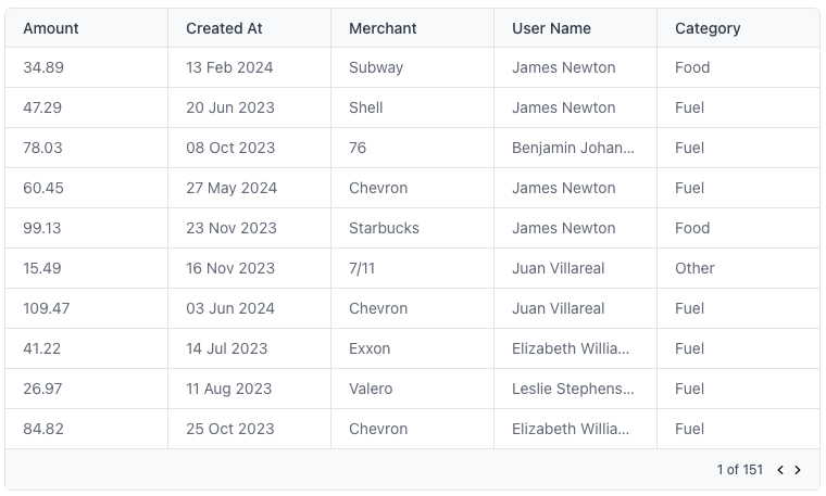
TableComponent (props: TableComponentProps) => JSX.Element
A table component. rows { [key: string]: any }[]
required
The rows of the table are an array of objects.
columns { label: string; field: string; }[]
required
The columns of the table are an array of label, field pairs.
Whether the table is loading.
PopoverComponent (props: PopoverComponentProps) => JSX.Element
A popover component. Whether the popover is open.
setIsOpen (isOpen: boolean) => void
required
A callback to set whether the popover is open.
The label of the popover trigger, if any.
The title of the popover, if any.
FilterPopoverComponent (props: FilterPopoverComponentProps) =>
JSX.Element
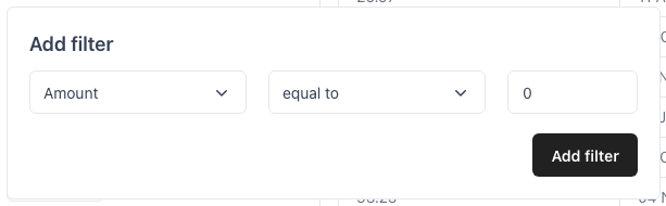
A popover component for filters created in the report builder. FilterPopoverComponentProps Whether the popover is open.
setIsOpen (isOpen: boolean) => void
required
A callback to set whether the popover is open.
The title of the popover, if any.
The text contents of the filter item.
onClickDelete (event: MouseEvent<HTMLElement>) => void
required
An event callback fired when the user clicks the delete button on the
filter.
SortPopoverComponent (props: SortPopoverComponentProps) => JSX.Element
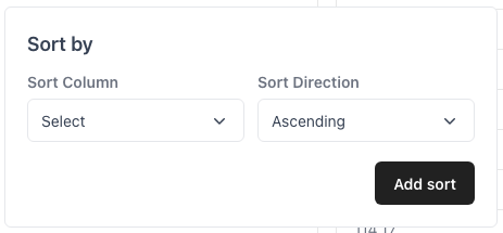
A popover component for sort items created in the report builder. SortPopoverComponentProps Whether the popover is open.
setIsOpen (isOpen: boolean) => void
required
A callback to set whether the popover is open.
The title of the popover, if any.
The text contents of the sort item.
onClickDelete (event: MouseEvent<HTMLElement>) => void
required
An event callback fired when the user clicks the delete button on the
sort item.
LimitPopoverComponent (props: LimitPopoverComponentProps) => JSX.Element
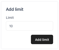
A popover component for limits created in the report builder. LimitPopoverComponentProps Whether the popover is open.
setIsOpen (isOpen: boolean) => void
required
A callback to set whether the popover is open.
The title of the popover, if any.
The text contents of the limit.
onClickDelete (event: MouseEvent<HTMLElement>) => void
required
An event callback fired when the user clicks the delete button on the
limit.
TabsComponent (props: TabsComponentProps) => JSX.Element
A small navigation menu used to switch between two or more states. The value of the currently selected tab.
onChange (event: ChangeEvent<HTMLSelectElement>) => void
required
An event callback fired when the selected tab changes.
options { label: string; value: string; }[]
required
An array of value, label pairs which represent the tabs to display.
CheckboxComponent (props: CheckboxComponentProps) => JSX.Element
A checkbox component. Whether the checkbox is checked.
A label for the checkbox component.
onChange (event: React.ChangeEvent<HTMLInputElement>) => void
required
An event callback fired when the checkbox’s value changes.
A container for the left sidebar. The children of the sidebar container.
ContainerComponent (props: ContainerComponentProps) => JSX.Element
A container for the main content (everything right of the sidebar). The children of the main container.
A component to show while the query results are loading.
SelectColumnComponent (props: SelectColumnComponentProps) =>
JSX.Element
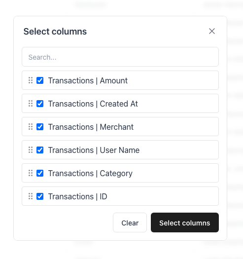
A component to show selected columns. SelectColumnComponentProps The label of the selected column.
Whether this column has been selected.
A callback that is fired when the user checks this columns’ checkbox.
DragHandle ({ dragIcon }: { dragIcon: () => JSX.Element }) => JSX.Element
The handle the user drags this column by.
DraggableColumnComponent (props: DraggableColumnComponentProps) => JSX.Element
A draggable component used to reorder columns. DraggableColumnComponentProps The label of the draggable column.
A callback that is fired when this column is removed from the query.
DragHandle ({ dragIcon }: { dragIcon: () => JSX.Element }) => JSX.Element
The handle the user drags this column by.
A heading element for the sidebar. The text content of the sidebar heading.
CardComponent (props: CardComponentProps) => JSX.Element
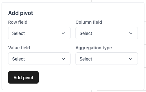
A card component used as a dismissable container of pivot information. The children of the container.
A callback that is fired when the card is clicked.
A callback that is fired the card is deleted.
LabelComponent (props: LabelComponentProps) => JSX.Element
A label component. The text content of the element.
A header component. The text content of the element.
TextComponent (props: TextComponentProps) => JSX.Element
A simple text component. The text content of the element.
A sub-header component describes a group of inputs. The label of the sub-header component.
ChartBuilderInputRowContainer (props: { children: ReactNode }) => JSX.Element
A container for each row of inputs for the ChartBuilder form. ChartBuilderInputRowContainerProps The children of the container.
ChartBuilderInputColumnContainer (props: { children: ReactNode }) => JSX.Element
A container for vertically-stacked rows of inputs for the ChartBuilder form. ChartBuilderInputColumnContainerProps The children of the container.
PivotRowContainer (props: { children: ReactNode }) => JSX.Element
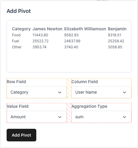
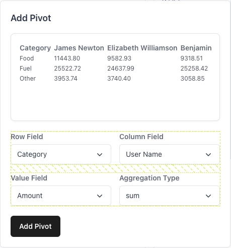
A container for each row of inputs for the pivot form. The children of the container.
PivotColumnContainer (props: { children: ReactNode }) => JSX.Element
A container for vertically-stacked rows of inputs for the pivot form. PivotColumnContainerProps The children of the container.
ChartBuilderFormContainer (props: { children: ReactNode }) => JSX.Element
A container for vertically-stacked sections of the chart builder form. ChartBuilderFormContainerProps The children of the container.
ErrorMessageComponent (props: { children: ReactNode }) => JSX.Element
A component that displays error messages. ErrorMessageComponentProps A component to show when no columns match the user’s query.
Whether the ReportBuilder is in admin mode (default: false).
Whether the ReportBuilder’s AI features are enabled (default: true).
pivotRecommendationsEnabled Whether the PivotModal’s AI features are enabled.
showChartBuilderTableFormatOptions Whether to show the table format options on the ChartBuilder form.
Applies the following classes to the ReportBuilder. This can be useful for TailwindCSS-style classname strings.
Custom styling properties for the ReportBuilder’s top-level container.
A report id that the Report Builder will query from and modify. onSubmitCreateReport (report: QuillReport) => void
A callback function that will trigger when a new report is created.
onSubmitEditReport (report: QuillReport) => void
A callback function that will trigger when a existing report is edited.
Whether to hide the copy SQL button.
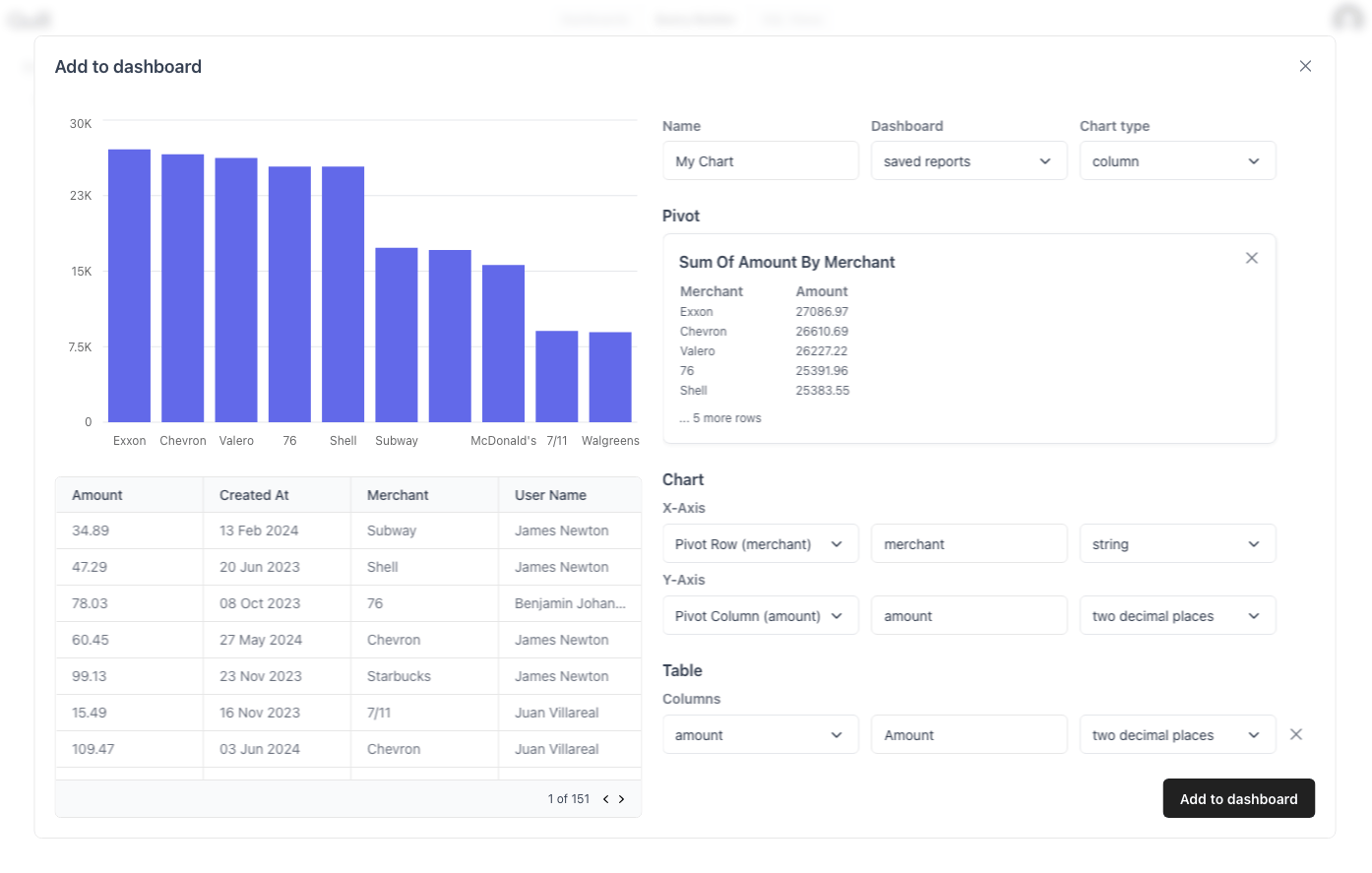
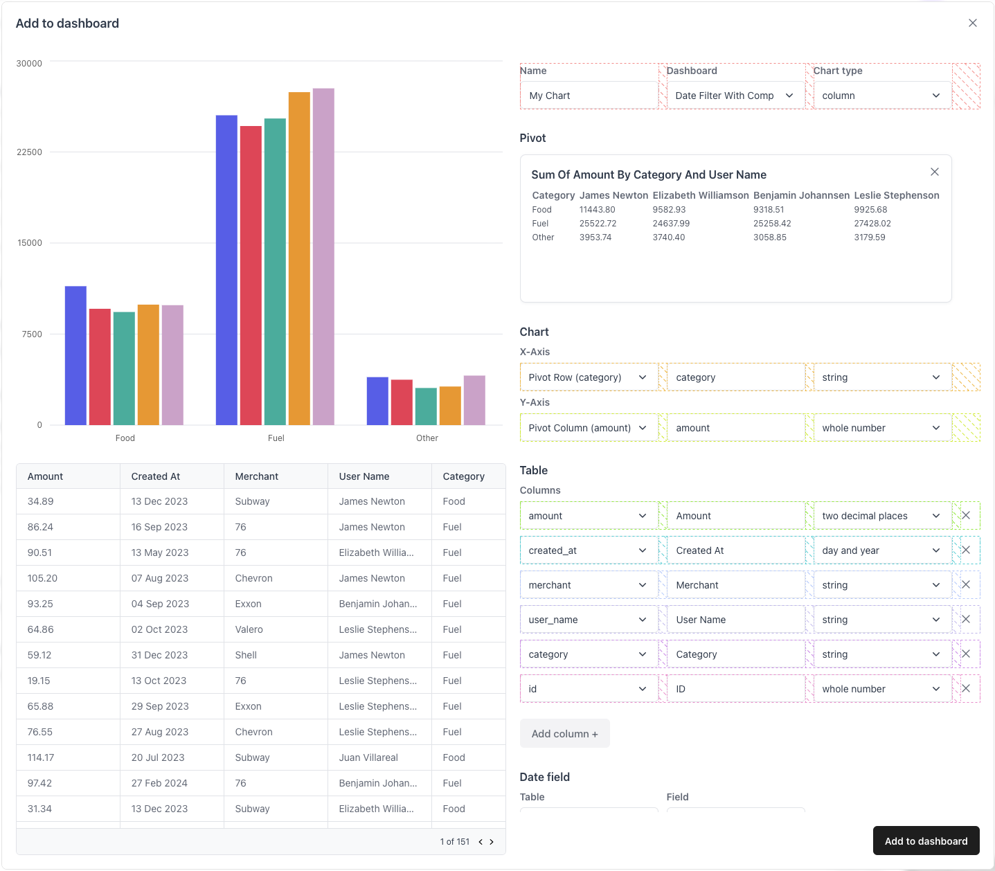
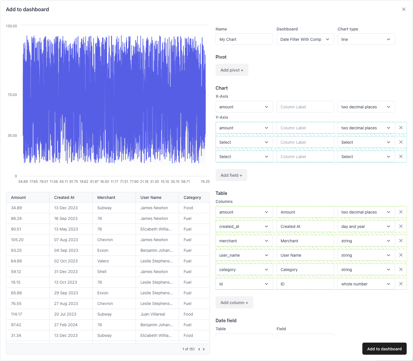
isChartBuilderHorizontalView Whether the chart builder is in horizontal view mode. Horizontal view mode is where the chart and table are displayed on the left
and the editing form is displayed on the right, rather than being stacked
vertically.


![Edit [Ant Design] Quill React Components](https://codesandbox.io/static/img/play-codesandbox.svg)