> ## Documentation Index
> Fetch the complete documentation index at: https://quill.co/docs/llms.txt
> Use this file to discover all available pages before exploring further.

# SQLEditor

> A UI component for creating and editing Quill Reports with SQL

```tsx App.tsx theme={null}
import { QuillProvider, SQLEditor } from "@quillsql/react";

function App() {
  return (
    <QuillProvider tenants={[{ tenantField: "customer_id", tenantIds: [2] }]} publicKey={process.env.QUILL_PUBLIC_KEY}>
      <SQLEditor />
    </QuillProvider>
  );
}
```

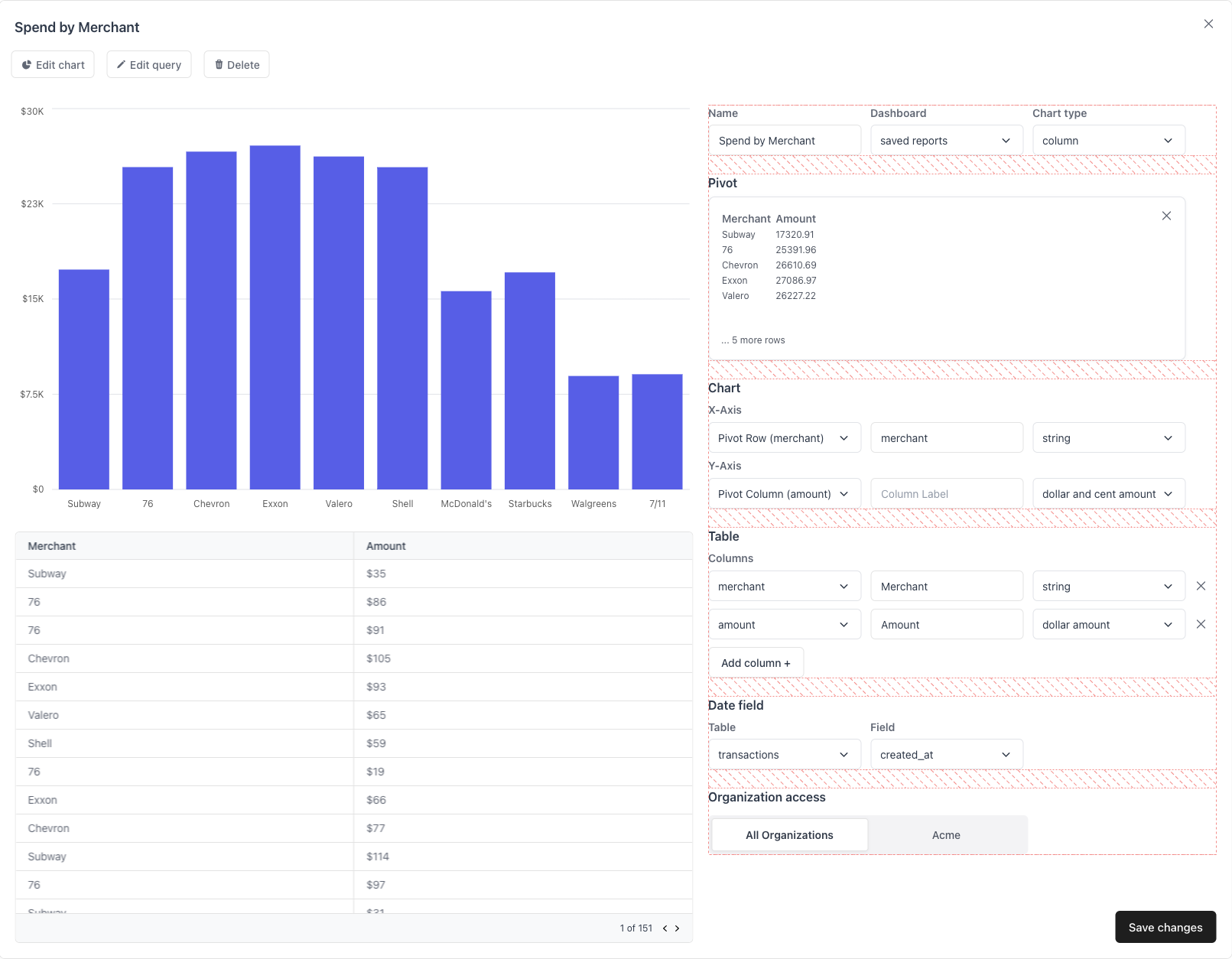
Allows your users to build and write custom SQL queries and then add those
queries into their dashboard as a metric, chart, or table.

<Info>Make sure `QuillProvider` is a parent of the `SQLEditor` component.</Info>

## Examples

<Tabs>
  <Tab title="Ant Design">
    [![Edit \[Ant Design\] Quill React Components](https://codesandbox.io/static/img/play-codesandbox.svg)](https://codesandbox.io/p/devbox/ant-design-quill-react-components-9qcs8k?embed=1)

    ```tsx theme={null}
    import { SQLEditor } from "@quillsql/react";

    import { AntTable } from "./ui/ant/Table";
    import { AntSelectComponent } from "./ui/ant/SelectComponent";
    import { AntButton, AntSecondaryButton } from "./ui/ant/Button";
    import { AntTextInput } from "./ui/ant/Input";

    export function AntSQLEditor() {
      return (
        <SQLEditor
          ButtonComponent={AntButton}
          SecondaryButtonComponent={AntSecondaryButton}
          TextInputComponent={AntTextInput}
          SelectComponent={AntSelectComponent}
          TableComponent={AntTable}
        />
      );
    }
    ```
  </Tab>

  <Tab title="Material Design">
    [![Edit \[Material Design\] Quill React Components](https://codesandbox.io/static/img/play-codesandbox.svg)](https://codesandbox.io/p/devbox/material-design-quill-react-components-d862dk?embed=1)

    ```tsx theme={null}
    import { SQLEditor } from "@quillsql/react";

    import { MaterialTable } from "./ui/material/Table";
    import { MaterialSelect } from "./ui/material/Select";
    import { MaterialButton, MaterialSecondaryButton } from "./ui/material/Button";
    import { MaterialTextInput } from "./ui/material/Input";

    export function MaterialSQLEditor() {
      return (
        <SQLEditor
          ButtonComponent={MaterialButton}
          SecondaryButtonComponent={MaterialSecondaryButton}
          TextInputComponent={MaterialTextInput}
          SelectComponent={MaterialSelect}
          TableComponent={MaterialTable}
        />
      );
    }
    ```
  </Tab>
</Tabs>

## Props

<ParamField path="ButtonComponent" type="(props: ButtonComponentProps) => JSX.Element">
  A primary button component.

  <Expandable defaultOpen={false} title="props">
    <img src="https://mintcdn.com/quill/uJxYp0QfD2nyydTi/images/button.png?fit=max&auto=format&n=uJxYp0QfD2nyydTi&q=85&s=52fbf69428285e29cac939579f5d9d95" width="171" height="60" data-path="images/button.png" />

    ```jsx Example theme={null}
    export function ButtonComponent({ onClick, label, disabled, icon }) {
    	return (
    		<button onClick={onClick} disabled={disabled}>
    			{icon}
    			{label}
    		</button>
    	);
    }
    ```

    <ParamField path="ButtonComponentProps" type="object">
      <Expandable title="properties" defaultOpen={true}>
        <ResponseField name="onClick" type="() => void" required>
          A callback fired when the button is clicked.
        </ResponseField>

        <ResponseField name="label" type="string" required>
          The text content of the button.
        </ResponseField>

        <ResponseField name="disabled" type="boolean">
          Whether the button is disabled.
        </ResponseField>

        <ResponseField name="icon" type="ReactNode">
          An icon to put in front of the label.
        </ResponseField>
      </Expandable>
    </ParamField>
  </Expandable>
</ParamField>

<ParamField path="SecondaryButtonComponent" type="(props: ButtonComponentProps) => JSX.Element">
  A secondary button component.

  <Expandable defaultOpen={false} title="props">
    <img src="https://mintcdn.com/quill/1rz9Mp2lIcxgjYLT/images/secondary_button.png?fit=max&auto=format&n=1rz9Mp2lIcxgjYLT&q=85&s=660918ab9c6e35d45c2dfc293d8c4127" width="139" height="49" data-path="images/secondary_button.png" />

    ```jsx Example theme={null}
    export function SecondaryButtonComponent({ onClick, label, disabled, icon }) {
    	return (
    		<button onClick={onClick} disabled={disabled}>
    			{icon}
    			{label}
    		</button>
    	);
    }
    ```

    <ParamField path="ButtonComponentProps" type="object">
      <Expandable title="properties" defaultOpen={true}>
        <ResponseField name="onClick" type="() => void" required>
          A callback fired when the button is clicked.
        </ResponseField>

        <ResponseField name="label" type="string" required>
          The text content of the button.
        </ResponseField>

        <ResponseField name="disabled" type="boolean">
          Whether the button is disabled.
        </ResponseField>

        <ResponseField name="icon" type="ReactNode">
          An icon to put in front of the label.
        </ResponseField>
      </Expandable>
    </ParamField>
  </Expandable>
</ParamField>

<ParamField path="DeleteButtonComponent" type="(props: DeleteButtonComponentProps) => JSX.Element">
  A small delete button used to click out of things. Usually an "X" icon.

  <Expandable defaultOpen={false} title="props">
    <img src="https://mintcdn.com/quill/uJxYp0QfD2nyydTi/images/delete_button.png?fit=max&auto=format&n=uJxYp0QfD2nyydTi&q=85&s=a7e30ed316ef21b4ab4e3b79c7f56500" width="46" height="48" data-path="images/delete_button.png" />

    ```jsx Example theme={null}
    import { deleteSVG } from "./ui/icons";
    export function DeleteButtonComponent({ onClick }) {
    	return <button onClick={onClick}>{deleteSVG}</button>;
    }
    ```

    <ParamField path="DeleteButtonComponentProps" type="object">
      <Expandable title="properties" defaultOpen={true}>
        <ResponseField name="onClick" type="() => void" required>
          A callback fired when the button is clicked.
        </ResponseField>
      </Expandable>
    </ParamField>
  </Expandable>
</ParamField>

<ParamField path="TextInputComponent" type="(props: TextInputComponentProps) => JSX.Element">
  A input element for getting text from the user.

  <Expandable defaultOpen={false} title="props">
    <img src="https://mintcdn.com/quill/1rz9Mp2lIcxgjYLT/images/text_input.png?fit=max&auto=format&n=1rz9Mp2lIcxgjYLT&q=85&s=f28dce23e5a61fea79731431eb51a576" width="210" height="76" data-path="images/text_input.png" />

    ```jsx Example theme={null}
    export function TextInputComponent({ id, width, value, label, placeholder, onChange }) {
    	return (
    		<label>
    			{label}
    			<input
    				id={id}
    				style={{ width }}
    				value={value}
    				placeholder={placeholder}
    				onChange={onChange}
    			/>
    		</label>
    	);
    }
    ```

    <ParamField path="TextInputComponentProps" type="object">
      <Expandable title="properties" defaultOpen={true}>
        <ResponseField name="id" type="string" required>
          The id of the input element.
        </ResponseField>

        <ResponseField name="width" type="number" required>
          The width of the input element in pixels.
        </ResponseField>

        <ResponseField name="value" type="string" required>
          The width of the input element in pixels.
        </ResponseField>

        <ResponseField name="label" type="string">
          A label for the text input.
        </ResponseField>

        <ResponseField name="placeholder" type="string">
          The placeholder for the input element.
        </ResponseField>

        <ResponseField name="onChange" type="(event: ChangeEvent<HTMLInputElement>) => void" required>
          An event callback that is fired when the input value changes.
        </ResponseField>
      </Expandable>
    </ParamField>
  </Expandable>
</ParamField>

<ParamField path="SelectComponent" type="(props: SelectComponentProps) => JSX.Element">
  A select element for letting the user select from a set of options.

  <Expandable defaultOpen={false} title="props">
    <img src="https://mintcdn.com/quill/1rz9Mp2lIcxgjYLT/images/select.png?fit=max&auto=format&n=1rz9Mp2lIcxgjYLT&q=85&s=0ed6bb7d4ad645485e7e0451bf0f8e7c" width="213" height="76" data-path="images/select.png" />

    ```jsx Example theme={null}
    export function SelectComponent({ value, label, width, onChange, options }) {
    	return (
    		<label>
    			{label}
    			<select value={value} onChange={onChange} style={{ width }}>
    				{options.map(({ value, label }) => <option value={value}>{label}</option>)}
    			</select>
    		</label>
    	);
    }
    ```

    <ParamField path="SelectComponentProps" type="object">
      <Expandable title="properties" defaultOpen={true}>
        <ResponseField name="value" type="string" required>
          The value of the select.
        </ResponseField>

        <ResponseField name="label" type="string">
          A label for the select.
        </ResponseField>

        <ResponseField name="options" type="{ value: string; label: string; }[]" required>
          The select options.
        </ResponseField>

        <ResponseField name="onChange" type="(event: ChangeEvent<HTMLInputElement>) => void" required>
          An event callback that is fired when the selected element changes.
        </ResponseField>

        <ResponseField name="width" type="number" required>
          The width of the select element in pixels.
        </ResponseField>
      </Expandable>
    </ParamField>
  </Expandable>
</ParamField>

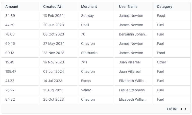
<ParamField path="TableComponent" type="(props: TableComponentProps) => JSX.Element">
  A table component.

  <Expandable defaultOpen={false} title="props">
    <img src="https://mintcdn.com/quill/1rz9Mp2lIcxgjYLT/images/table.png?fit=max&auto=format&n=1rz9Mp2lIcxgjYLT&q=85&s=3d34b61e118813ac78870ad5a98eb336" width="760" height="457" data-path="images/table.png" />

    ```jsx Example theme={null}
    import { Table } from "./ui/table";
    import { LoadingSkeleton } from "./ui/loading";

    export function TableComponent({ rows, columns, isLoading }) {
    	if (isLoading) return <LoadingSkeleton />
    	return <Table rows={rows} columns={columns} />;
    }
    ```

    <ParamField path="TableComponentProps" type="object">
      <Expandable title="properties" defaultOpen={true}>
        <ResponseField name="rows" type="{ [key: string]: any }[]" required>
          The rows of the table are an array of objects.
        </ResponseField>

        <ResponseField name="columns" type="{ label: string; field: string; }[]" required>
          The columns of the table are an array of label, field pairs.
        </ResponseField>

        <ResponseField name="isLoading" type="boolean">
          Whether the table is loading.
        </ResponseField>
      </Expandable>
    </ParamField>
  </Expandable>
</ParamField>

<ParamField path="LoadingComponent" type="() => JSX.Element">
  A component to show while the query results are loading.
</ParamField>

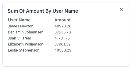
<ParamField path="CardComponent" type="(props: CardComponentProps) => JSX.Element">
  A card component used as a dismissable container of pivot information.

  <Expandable defaultOpen={false} title="props">
    <img src="https://mintcdn.com/quill/uJxYp0QfD2nyydTi/images/card.png?fit=max&auto=format&n=uJxYp0QfD2nyydTi&q=85&s=eb8cb10e24c7426ce15a05c4574659db" width="430" height="229" data-path="images/card.png" />

    ```jsx Example theme={null}
    import { Card } from "./ui/card";
    export function CardComponent({ onClick, onDelete, children }) {
    	const style = { position: 'absolute', top: 0, right: 0 };
    	return (
    		<Card onClick={onClick} style={{ position: 'relative' }}>
    			{onDelete && <DeleteButton style={style} onClick={onDelete} />}
    			{children}
    		</Card>
    	);
    }
    ```

    <ParamField path="CardComponentProps" type="object">
      <Expandable title="properties" defaultOpen={true}>
        <ResponseField name="children" type="ReactNode" required>
          The children of the container.
        </ResponseField>

        <ResponseField name="onClick" type="() => void">
          A callback that is fired when the card is clicked.
        </ResponseField>

        <ResponseField name="onDelete" type="() => void">
          A callback that is fired the card is deleted.
        </ResponseField>
      </Expandable>
    </ParamField>
  </Expandable>
</ParamField>

<ParamField path="ModalComponent" type="(props: ModalComponentProps) => JSX.Element">
  A modal component to use to open the add to dashboard dialog.

  <Expandable defaultOpen={false} title="props">
    <img src="https://mintcdn.com/quill/uJxYp0QfD2nyydTi/images/modal.png?fit=max&auto=format&n=uJxYp0QfD2nyydTi&q=85&s=a707312ef388177a79a05f75089ae0d2" width="493" height="525" data-path="images/modal.png" />

    ```jsx Example theme={null}
    import { Modal } from "./ui/modal";
    export function ModalComponent({ isOpen, setIsOpen, title, children, width, height }) {
    	return (
    		<Modal
    			isOpen={isOpen}
    			setIsOpen={setIsOpen}
    			title={title}
    			style={{ width, height }}
    		>
    			{children}
    		</Modal>
    	);
    }
    ```

    <ParamField path="ModalComponentProps" type="object">
      <Expandable title="properties" defaultOpen={true}>
        <ResponseField name="isOpen" type="boolean" required>
          Whether the modal is open.
        </ResponseField>

        <ResponseField name="setIsOpen" type="(isOpen: boolean) => void" required>
          A callback to set whether the modal is open.
        </ResponseField>

        <ResponseField name="title" type="string">
          The title of the modal, if any.
        </ResponseField>

        <ResponseField name="children" type="ReactNode" required>
          The body of the modal.
        </ResponseField>

        <ResponseField name="width" type="number">
          The width of the modal, in pixels.
        </ResponseField>

        <ResponseField name="height" type="number">
          The height of the modal, in pixels.
        </ResponseField>
      </Expandable>
    </ParamField>
  </Expandable>
</ParamField>

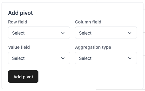
<ParamField path="PopoverComponent" type="(props: PopoverComponentProps) => JSX.Element">
  A popover component.

  <Expandable defaultOpen={false} title="props">
    <img src="https://mintcdn.com/quill/uJxYp0QfD2nyydTi/images/pivot_popover.png?fit=max&auto=format&n=uJxYp0QfD2nyydTi&q=85&s=5f1d1373307f31f1c7d8fa186bdf286b" width="468" height="295" data-path="images/pivot_popover.png" />

    ```jsx Example theme={null}
    import { Popover } from "./ui/popover";

    export function PopoverComponent({ isOpen, setIsOpen, popoverTitle, popoverChildren }) {
    	return (
    		<Popover isOpen={isOpen} setIsOpen={setIsOpen} title={popoverTitle}>
    			{popoverChildren}
    		</Popover>
    	);
    }
    ```

    <ParamField path="PopoverComponentProps" type="object">
      <Expandable title="properties" defaultOpen={true}>
        <ResponseField name="isOpen" type="boolean" required>
          Whether the modal is open.
        </ResponseField>

        <ResponseField name="setIsOpen" type="(isOpen: boolean) => void" required>
          A callback to set whether the modal is open.
        </ResponseField>

        <ResponseField name="triggerLabel" type="string">
          The label for the trigger of this popover.
        </ResponseField>

        <ResponseField name="popoverTitle" type="string">
          The title of the popover.
        </ResponseField>

        <ResponseField name="popoverChildren" type="ReactNode">
          The children of this popover.
        </ResponseField>
      </Expandable>
    </ParamField>
  </Expandable>
</ParamField>

<ParamField path="LabelComponent" type="(props: { label: string }) => JSX.Element">
  A label component.

  <Expandable defaultOpen={false} title="props">
    <img src="https://mintcdn.com/quill/uJxYp0QfD2nyydTi/images/label.png?fit=max&auto=format&n=uJxYp0QfD2nyydTi&q=85&s=c175dc6dfb111586265bfc7155b4374f" width="77" height="94" data-path="images/label.png" />

    ```jsx Example theme={null}
    export function LabelComponent({ label }) {
    	return <h4>{label}</h4>;
    }
    ```

    <ParamField path="LabelComponentProps" type="object">
      <Expandable title="properties" defaultOpen={true}>
        <ResponseField name="label" type="() => void" required>
          The label of the label component.
        </ResponseField>
      </Expandable>
    </ParamField>
  </Expandable>
</ParamField>

<ParamField path="HeaderComponent" type="(props: { label: string }) => JSX.Element">
  A header component.

  <Expandable defaultOpen={false} title="props">
    <img src="https://mintcdn.com/quill/uJxYp0QfD2nyydTi/images/header.png?fit=max&auto=format&n=uJxYp0QfD2nyydTi&q=85&s=53760745ec4a6512038fe022c1c64ec2" width="429" height="100" data-path="images/header.png" />

    ```jsx Example theme={null}
    export function HeaderComponent({ label }) {
    	return <h2>{label}</h2>;
    }
    ```

    <ParamField path="HeaderComponentProps" type="object">
      <Expandable title="properties" defaultOpen={true}>
        <ResponseField name="label" type="() => void" required>
          The label of the header component.
        </ResponseField>
      </Expandable>
    </ParamField>
  </Expandable>
</ParamField>

<ParamField path="SubHeaderComponent" type="(props: { label: string }) => JSX.Element">
  A sub-header component describes a group of inputs.

  <Expandable defaultOpen={false} title="props">
    <img src="https://mintcdn.com/quill/1rz9Mp2lIcxgjYLT/images/subheader.png?fit=max&auto=format&n=1rz9Mp2lIcxgjYLT&q=85&s=dbf2ce79d05e9f11ff8a6c343b45f73e" width="636" height="75" data-path="images/subheader.png" />

    ```jsx Example theme={null}
    export function SubHeaderComponent({ label }) {
    	return <h3>{label}</h3>;
    }
    ```

    <ParamField path="SubHeaderComponentProps" type="object">
      <Expandable title="properties" defaultOpen={true}>
        <ResponseField name="label" type="() => void" required>
          The label of the sub-header component.
        </ResponseField>
      </Expandable>
    </ParamField>
  </Expandable>
</ParamField>

<ParamField path="TextComponent" type="(props: { label: string }) => JSX.Element">
  A simple text component.

  <Expandable defaultOpen={false} title="props">
    <img src="https://mintcdn.com/quill/1rz9Mp2lIcxgjYLT/images/text.png?fit=max&auto=format&n=1rz9Mp2lIcxgjYLT&q=85&s=5f25ed46ab555dbb6c3b3f0a7d8d5d3c" width="93" height="95" data-path="images/text.png" />

    ```jsx Example theme={null}
    export function TextComponent({ label }) {
    	return <p>{label}</p>;
    }
    ```

    <ParamField path="TextComponentProps" type="object">
      <Expandable title="properties" defaultOpen={true}>
        <ResponseField name="label" type="() => void" required>
          The label of the text component.
        </ResponseField>
      </Expandable>
    </ParamField>
  </Expandable>
</ParamField>

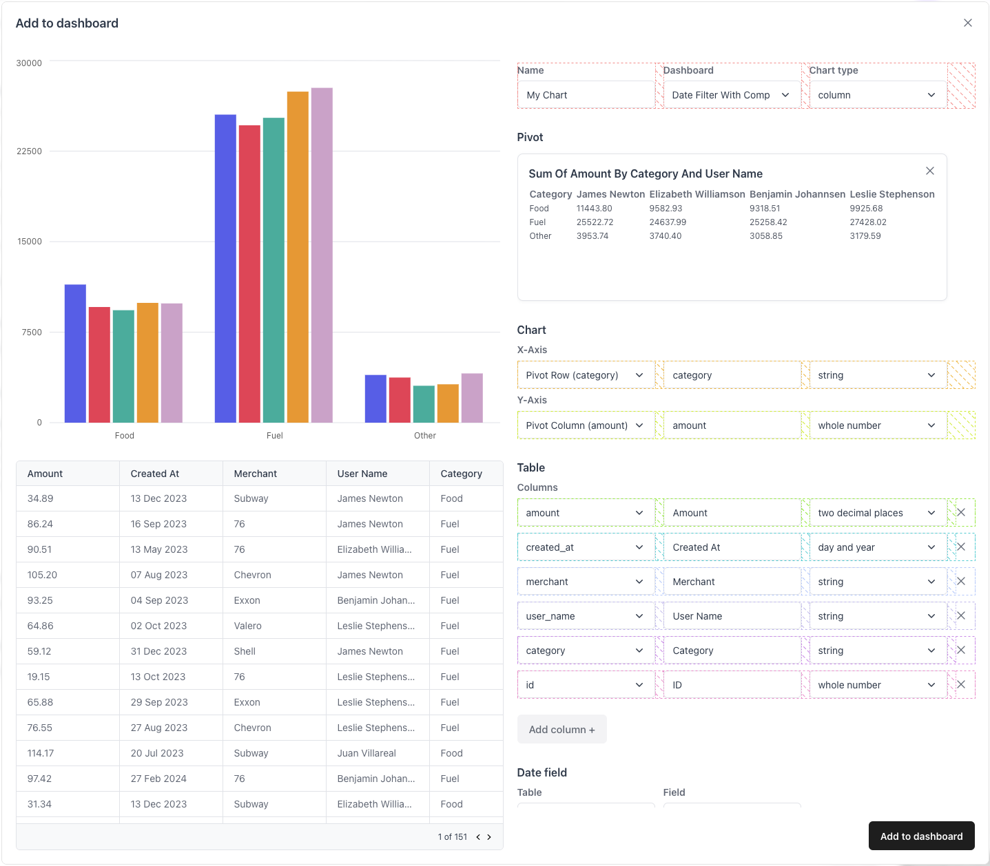
<ParamField path="ChartBuilderInputRowContainer" type="(props: { children: ReactNode }) => JSX.Element">
  A container for each row of inputs for the ChartBuilder form.

  <Expandable defaultOpen={false} title="props">
    <img src="https://mintcdn.com/quill/uJxYp0QfD2nyydTi/images/chart_builder_input_row_container.png?fit=max&auto=format&n=uJxYp0QfD2nyydTi&q=85&s=ba098d436528a38be885871ebf262d2a" width="1437" height="1258" data-path="images/chart_builder_input_row_container.png" />

    <ParamField path="ChartBuilderInputRowContainerProps" type="object">
      <Expandable title="properties">
        <ResponseField name="children" type="ReactNode" required>
          The children of the container.
        </ResponseField>
      </Expandable>
    </ParamField>
  </Expandable>
</ParamField>

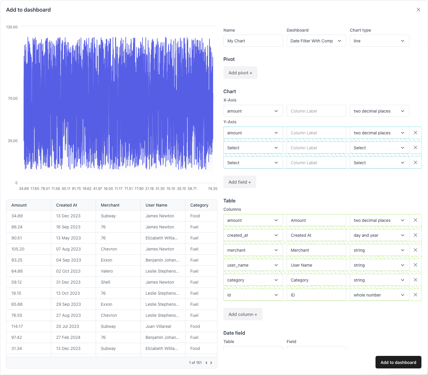
<ParamField path="ChartBuilderInputColumnContainer" type="(props: { children: ReactNode }) => JSX.Element">
  A container for vertically-stacked rows of inputs for the ChartBuilder form.

  <Expandable defaultOpen={false} title="props">
    <img src="https://mintcdn.com/quill/uJxYp0QfD2nyydTi/images/chart_builder_input_column_container.png?fit=max&auto=format&n=uJxYp0QfD2nyydTi&q=85&s=f3a045b127d5ccd37c123a538aeb46e4" width="1435" height="1256" data-path="images/chart_builder_input_column_container.png" />

    <ParamField path="ChartBuilderInputColumnContainerProps" type="object">
      <Expandable title="properties">
        <ResponseField name="children" type="ReactNode" required>
          The children of the container.
        </ResponseField>
      </Expandable>
    </ParamField>
  </Expandable>
</ParamField>

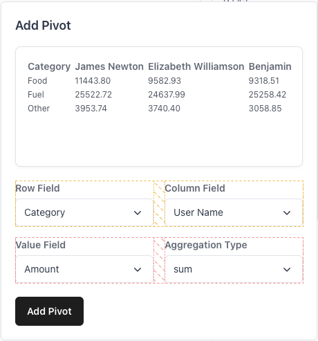
<ParamField path="PivotRowContainer" type="(props: { children: ReactNode }) => JSX.Element">
  A container for each row of inputs for the pivot form.

  <Expandable defaultOpen={false} title="props">
    <img src="https://mintcdn.com/quill/uJxYp0QfD2nyydTi/images/pivot_row_container.png?fit=max&auto=format&n=uJxYp0QfD2nyydTi&q=85&s=84b7c750344d4d0c2e65f7f8926db068" width="460" height="493" data-path="images/pivot_row_container.png" />

    <ParamField path="PivotRowContainerProps" type="object">
      <Expandable title="properties">
        <ResponseField name="children" type="ReactNode" required>
          The children of the container.
        </ResponseField>
      </Expandable>
    </ParamField>
  </Expandable>
</ParamField>

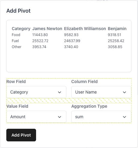
<ParamField path="PivotColumnContainer" type="(props: { children: ReactNode }) => JSX.Element">
  A container for vertically-stacked rows of inputs for the pivot form.

  <Expandable defaultOpen={false} title="props">
    <img src="https://mintcdn.com/quill/uJxYp0QfD2nyydTi/images/pivot_column_container.png?fit=max&auto=format&n=uJxYp0QfD2nyydTi&q=85&s=8c122f8234d1b288c85aaa79e8ceae4d" width="459" height="492" data-path="images/pivot_column_container.png" />

    <ParamField path="PivotColumnContainerProps" type="object">
      <Expandable title="properties">
        <ResponseField name="children" type="ReactNode" required>
          The children of the container.
        </ResponseField>
      </Expandable>
    </ParamField>
  </Expandable>
</ParamField>

<ParamField path="ChartBuilderFormContainer" type="(props: { children: ReactNode }) => JSX.Element">
  A container for vertically-stacked sections of the chart builder form.

  <Expandable defaultOpen={false} title="props">
    <img src="https://mintcdn.com/quill/uJxYp0QfD2nyydTi/images/chart_builder_form_container.png?fit=max&auto=format&n=uJxYp0QfD2nyydTi&q=85&s=822863cd6e22421c2ea7360fa3b3a799" width="1611" height="1254" data-path="images/chart_builder_form_container.png" />

    <ParamField path="ChartBuilderFormContainerProps" type="object">
      <Expandable title="properties">
        <ResponseField name="children" type="ReactNode" required>
          The children of the container.
        </ResponseField>
      </Expandable>
    </ParamField>
  </Expandable>
</ParamField>

<ParamField path="ErrorMessageComponent" type="(props: { children: ReactNode }) => JSX.Element">
  A component that displays error messages.

  <Expandable defaultOpen={false} title="props">
    <img src="https://mintcdn.com/quill/uJxYp0QfD2nyydTi/images/error_message.png?fit=max&auto=format&n=uJxYp0QfD2nyydTi&q=85&s=0a9dfde75d489dff2fb964ccc200cb45" width="421" height="36" data-path="images/error_message.png" />

    ```jsx Example theme={null}
    export function ErrorMessageComponent({ errorMessage }) {
    	return <div>{errorMessage}</div>
    }
    ```

    <ParamField path="ErrorMessageComponentProps" type="object">
      <Expandable title="properties" defaultOpen={true}>
        <ResponseField name="errorMessage" type="ReactNode" required>
          The error message.
        </ResponseField>
      </Expandable>
    </ParamField>
  </Expandable>
</ParamField>

<ParamField path="onChangeQuery" type="(query: string) => void">
  A callback that is fired when the query changes.
</ParamField>

<ParamField path="onChangeData" type="(query: string) => void">
  A callback that is fired when the data changes.
</ParamField>

<ParamField path="onChangeFields" type="(query: string) => void">
  A callback that is fired when the data fields change.
</ParamField>

<ParamField path="onChangeColumns" type="(query: string) => void">
  A callback that is fired when the data columns change.
</ParamField>

<ParamField path="onAddToDashboardComplete" type="(report: QuillReport) => void">
  A callback that is fired when a new report has been added to a dashboard.
</ParamField>

<ParamField path="isChartBuilderHorizontalView" type="boolean" default={true}>
  Whether the ReportBuilder is in admin mode (default: `true`).
</ParamField>

<ParamField path="isChartBuilderEnabled" type="boolean" default={true}>
  A callback that is fired when the data columns change.
</ParamField>

<ParamField path="isNewQueryEnabled" type="boolean" default={true}>
  Whether the "new query" button is enabled.
</ParamField>

<ParamField path="showTableFormatOptions" type="boolean" default={true}>
  Whether to show table format options.
</ParamField>

<ParamField path="showDateFieldOptions" type="boolean" default={true}>
  Whether to show date field options.
</ParamField>

<ParamField path="showAccessControlOptions" type="boolean" default={true}>
  Whether to show access control options.
</ParamField>

<ParamField path="report" type="QuillReport">
  An existing report to edit.
</ParamField>

<ParamField path="defaultQuery" type="string">
  The default query to use as a placeholder.
</ParamField>

<ParamField path="destinationDashboard" type="string">
  The default dashboard to add reports to.
</ParamField>

<ParamField path="chartBuilderTitle" type="string">
  The title of the ChartBuilder dialog.
</ParamField>

<ParamField path="chartBuilderButtonLabel" type="string">
  The label of the button to add the current query to a dashboard.
</ParamField>

<ParamField path="addToDashboardButtonLabel" type="string" default="Add to dashboard">
  The label of the button to open the ChartBuilder dialog.
</ParamField>

<ParamField path="organizationName" type="string">
  The name of the current organization.
</ParamField>

<ParamField path="className" type="string">
  Styles the top-level container of the SQLEditor.

  This can be useful for TailwindCSS-style classname strings.
</ParamField>

<ParamField path="containerStyle" type="CSSProperties">
  Custom styling properties for the ReportBuilder's top-level container.
</ParamField>